

01. Design Brief
This was a team project tasked during my training at General Assembly Singapore’s User Experience Design Immersive. The task was to redesign an existing mobile service application. The duration was two weeks ending with a presenting an interactive prototype among other deliverables.
02. Identifying Pain Points
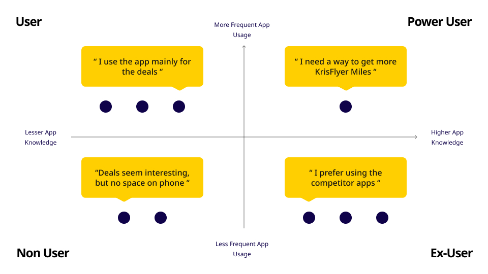
Firstly, the team conducted interviews with users aged between 25-45 years of varying levels of tech competency. The next step was to organise contextual inquiries, where we observed them using the app. Afterwhich we uncovered the following key insights.
- Deals are a prime interest to most users, but a vast majority stated deals were not prominent enough.
- Over 80% of users were unaware of the existing loyalty program on Chope.
- A significant portion of users felt the app lacked visual cues, such as price range and deals.
- Over half said the app lacked features such as reviews, ratings and recommendations to help decide on booking.
03. Problem Statement
Chope needs to present its loyalty program in a simplified and prominent manner so that users can understand the savings they can make when they use the Chope app.
04. Behavioural Analysis
05. Creating Personas
After compiling our research notes, the next step was to create personas. Redesigning for the ‘normal user’ was our first priority. Taking into account specific requests and suggestions to improve the current platform.
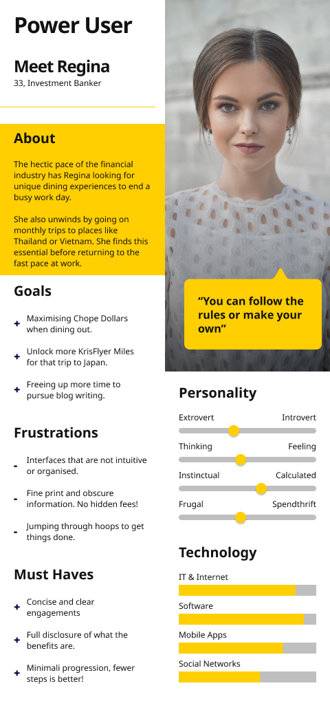
Next, we created a ‘Power User’ persona. This persona represented a very specific demographic who would find ‘hacks’ or ways to maximize their experience. Compared to the Normal User, the Power User was aware of the loyalty program. The secondary task for us was to ‘convert’ normal users to power users.
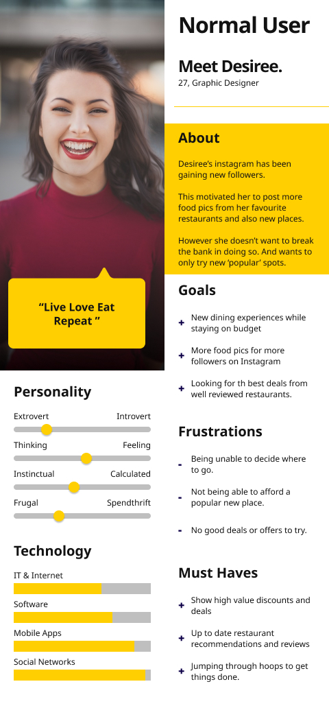
The first area of improvement was presenting the deals and loyalty programme in a simplified and prominent manner. Also, if users understood the savings made when they used the Chope app, it would encourage them to stay on the platform.
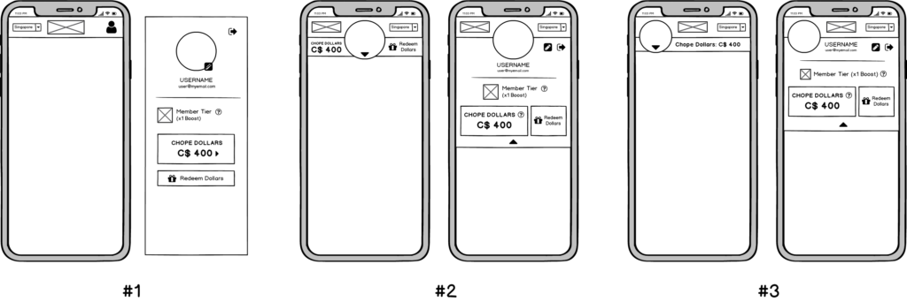
06. Design Direction
Compared to other competing apps, users found that most competitors were more upfront about deals. Instead of a complete overhaul, the team adjusted the existing app, retaining the original look while including new features and functions. That way, current customers would see unique benefits upfront to encourage quicker decisions.
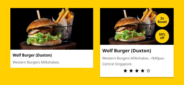
The figure above shows the original restaurant card. It had a thumbnail with the restaurant name and a descriptive caption. Our revision added “benefits badges” aligned along the right of the thumbnail, expanded caption and new review stars. This way, it would explicitly display enticing details to encourage quicker decision-making in the booking.
07. Adding Reviews
Next was coming up with a review system to facilitate the review stars for the cards. New components included a simple text area input for users to express their thoughts about their dining experience and a tactile set of star buttons to submit a general rating.

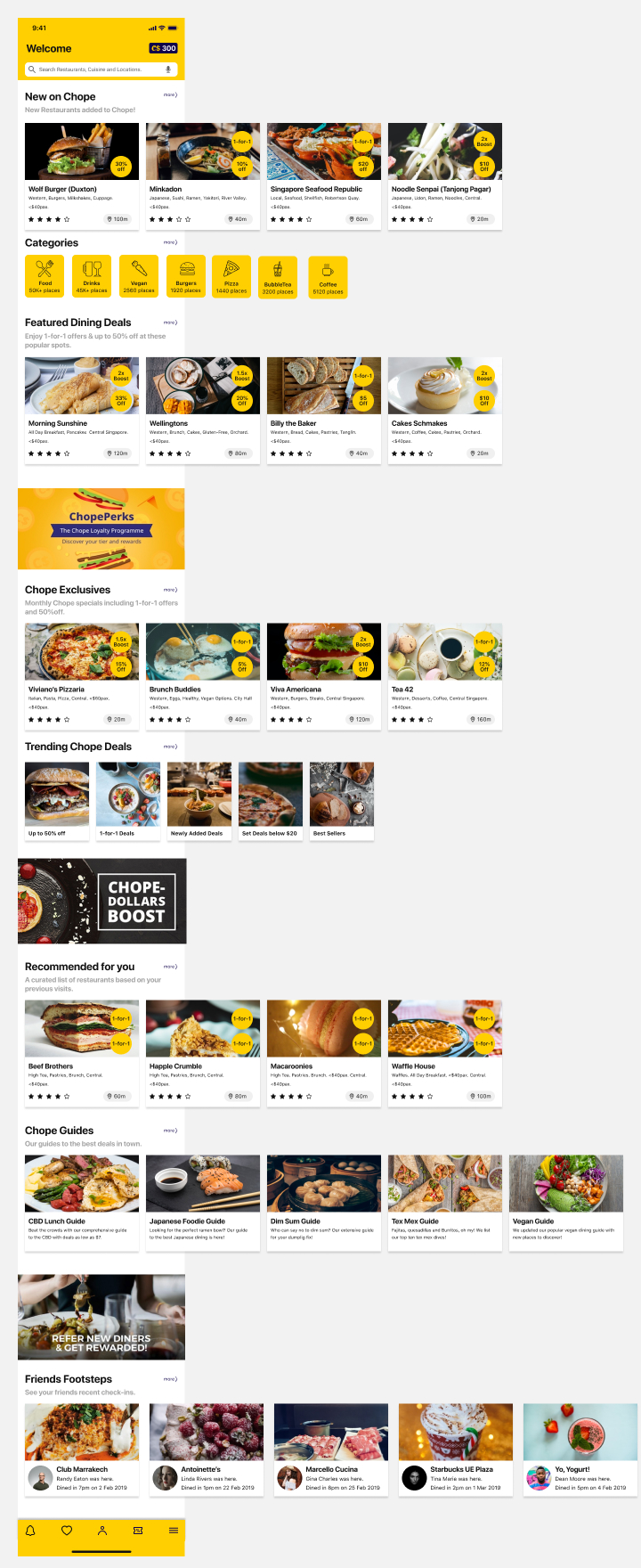
08. Reordering the Landing
Next, we conducted a “card-sorting” activity, where users would determine the organisation of the landing screen. This helped us determine what categories to add or remove and how to arrange them according to user preferences and relevance.
09. Putting it together
With all the user input gathered along with the redesigned elements, we came up with the following design for the new landing page.
10. Further Usability Tests and Iterations
Compared with the existing Chope app:11.7% increase in user satisfaction using the System Usability Scale (SUS).
11. Reflection
One aspect that the team couldn’t accomplish was the restructuring of the existing app’s current search feature. The search bar on the main screen and search page were two separate entities, which confused a lot of users. A major complaint was how the search managed it’s filter parameters, by having no indication whether the filters were selected at all.