Lummo (formerly Bukukas) was Indonesia’s premiere digital bookkeeping app for small and medium sized enterprises. It enabled business owners automated methods to easily track sales, profits, and expenses.
Lummo digitises these processes, providing an end-to-end way of streamlining financial management. All without the complexity of accounting workloads and manual bookkeeping, that were inefficient and error-prone.
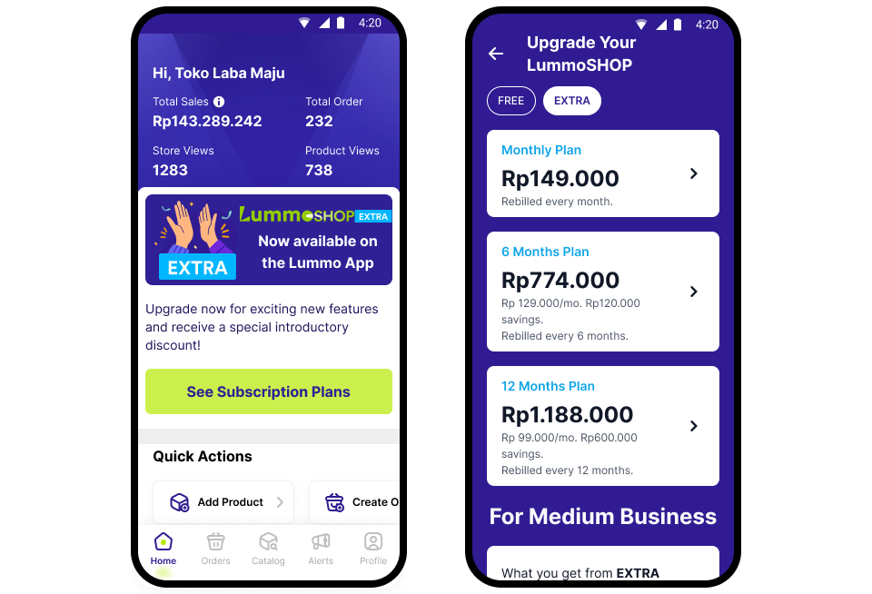
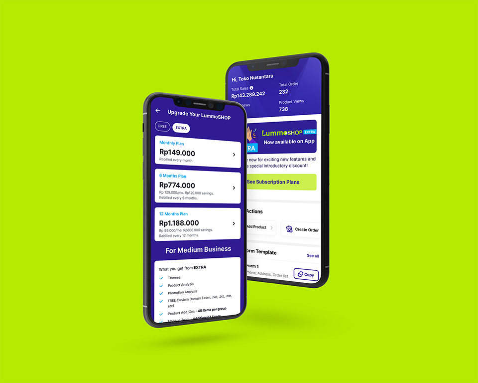
For this project, I implemented new subscription tiers for the mobile app, highlighting new and enhanced features to the app experience. I completed all design efforts in two sprints (4 weeks) for engineering hand-off.
Objective:
To successfully launch and implement a multi-tiered subscription model for the mobile app, enabling users with powerful new features while driving sustainable revenue growth.
Target Audience:
Current and potential users of the mobile app. This ranges from small business owners to larger e-commerce operations.
Value Proposition:
The multi-tiered subscription model offer all users enhanced features based on their chosen subscription level, providing greater value and flexibility to meet their specific needs.

Market Research and Analysis
- Competitor Analysis: Evaluate the subscription models of competitor apps and identify gaps in the market.
- User Segmentation: Analyze our user base to understand their needs, pain points, and willingness to pay for premium features.
- Pricing Strategy: Develop a pricing structure for the different subscription tiers that aligns with user value and market trends.
Subscription Tier Structure
- Basic (Free): Existing features and new additions to attract new users and demonstrate the app’s value.
- Extra (Paid): Provide essential features for effective online store management and a new team function for multiple accounts.
- Plus (Paid): Offer advanced features and benefits for users with more complex needs and social media ad integration.
- Enterprise (Paid): Customizable solutions for large-scale e-commerce operations.
Go-to-market-plan
- Pre-Launch:
- Conduct beta testing with a select group of users to gather feedback and refine the subscription model.
- Develop a communication plan to inform users about the upcoming changes and benefits of the new subscription model.
- Launch:
- Announce the launch of the new subscription model through in-app notifications, email marketing, and social media.
- Offer promotional pricing or discounts to incentivize users to upgrade to paid tiers.
- Post-Launch:
- Monitor user engagement and feedback to measure the success of the new subscription model.
- Continuously optimize the subscription tiers and features based on user data and market trends.
- Implement a customer retention strategy to minimize churn and maximize subscriber lifetime value.
Marketing and Comms
- Content Marketing: Create blog posts, articles, and social media content highlighting the benefits of each subscription tier.
- Email Marketing: Develop targeted email campaigns to promote the new subscription model and encourage upgrades.
- In-App Messaging: Use in-app notifications and messages to inform users about the new subscription options and their benefits.
- Social Media: Utilize social media platforms to generate buzz and engage with users about the new subscription model.

Sales and Support
- Sales Enablement: Provide sales teams with the necessary training and resources to effectively sell the new subscription plans.
- Customer Support: Ensure customer support teams are equipped to handle inquiries and issues related to the subscription model.
Key Metrics
Subscription Conversion Rate: Track the percentage of free users who upgrade to paid subscription tiers.
Churn Rate: Monitor the rate at which subscribers cancel their subscriptions.
Average Revenue Per User (ARPU): Measure the average revenue generated per user across all subscription tiers.
Customer Lifetime Value (CLTV): Calculate the total revenue generated by a customer over their lifetime.
Customer Acquisition Cost (CAC): Track the cost of acquiring a new customer.
Design Process
First impressions and clearly demonstrating value was crucial to driving adoption for the paid plans. So maximising visibility was key, meaning entry points had to appear right on the app landing screen – if possible within the viewport area. An initial draft utilised the promotional area placed third from the top of the screen.
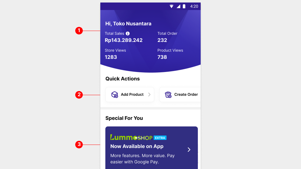
While favourable to engineering and initial timeline discussions by reusing existing components, it had some issues. Firstly, it fought for attention with the more prominent Overview area.
Also, the promotion area were carousel items with limited space that scrolled off-screen automatically. These factors greatly reduced visibility for the entry point, and potentially reduced engagement from users.
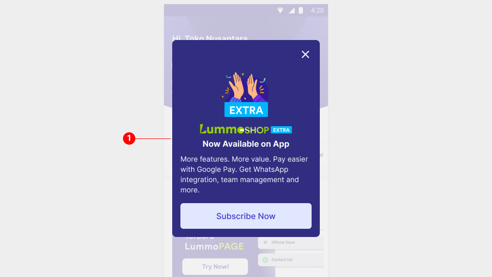
To counter this, I proposed a modal popup above a faded scrim. This way the messaging got maximum attention over other elements. And, it provided more screen space to better explain the benefits of subscribing.
More importantly, it had obvious CTAs to enter the subscription flow. This modal would appear during launch phase for all users. Users who dismissed the popup a set number of times, will stop seeing it.
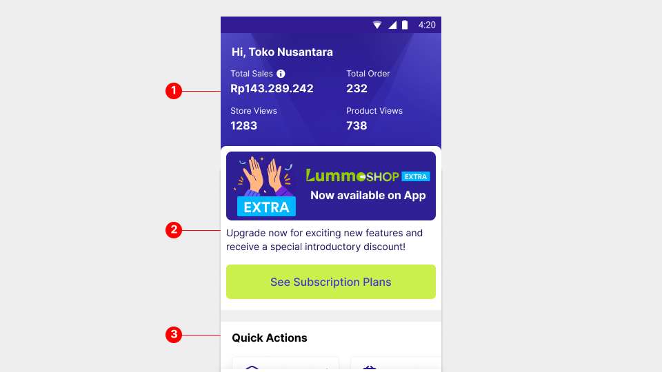
Next, I created a new section on the landing screen above the quick actions section. This required reconfiguring the overview section and the entire landing page stack. I did receive some pushback from some stakeholders. However since revenue generation was top priority, I convinced everyone that a new section was the best way forward. Next up was designing the user journey for subscription.
Subscription screen
First draft was to mimic the mobile web version of the subscription screen. Note subscription plans were made available before the mobile app. This would minimise development time and retain consistency within the design system.
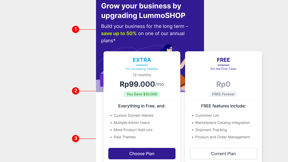
Testing showed users didn’t like scrolling between cards to compare the unique selling points of each plan. And a large amount of users couldn’t view the card in it’s entirety, mostly due to a multitude of varying screen sizes. With this in mind I decided that an improved user experience and interface was necessary.

First I mapped out the information architecture, strategically positioning key information and selling points. Additionally, I found ways of minimising click-throughs to reduce page depth, for a more seamless experience.
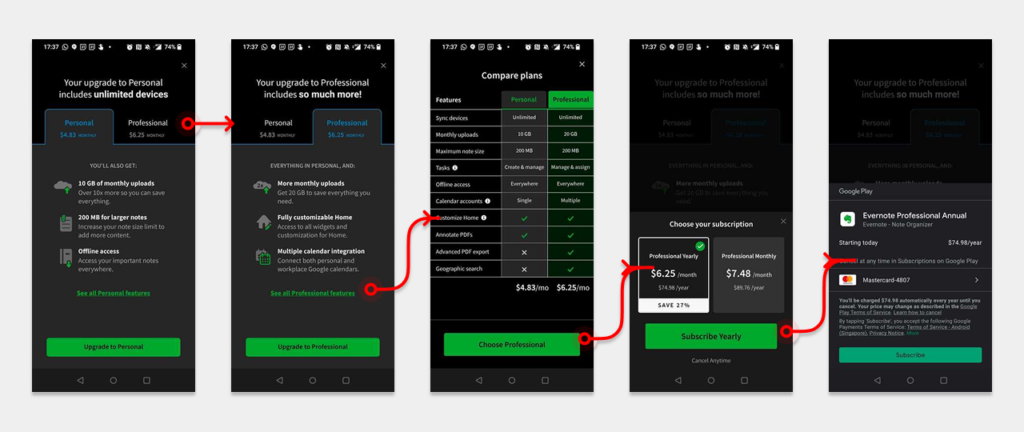
Working with the UI team I proposed a new interface with possible new elements to be added to the design system. I organised a workshop with UI designers, developers and project managers to benchmark with other existing apps. Once we all agreed on feasibility and time constraints, I quickly got approval to proceed with the following design.
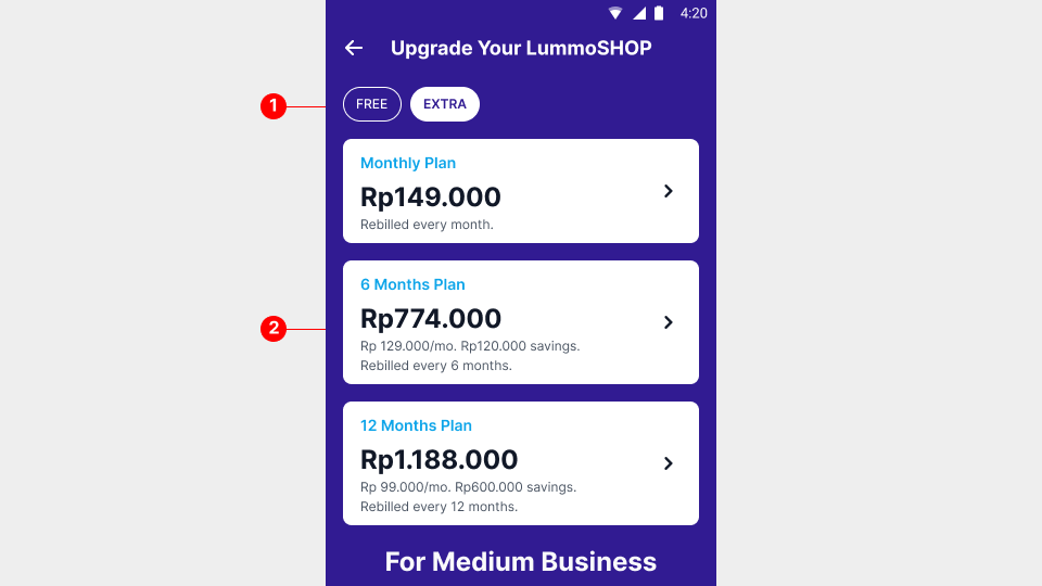
At the top, merchants toggle between the screens using tier selection chips. Each screen had cards to select the preferred payment plan. This was also a node for the monetisation and data analytics team to closely monitor click-through, conversion rates, and adjust pricing accordingly if needed.
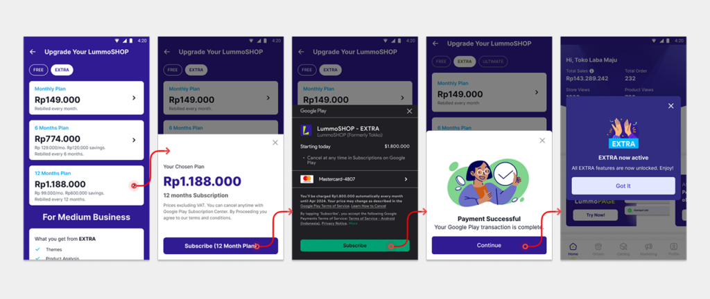
Tapping on the cards trigger a single bottomsheet popup. The payment process was kept straightforward, with each step clearly indicating the next action. For the initial launch phase, payment options were priced for monthly, every 6 months or yearly. Additional tiers would be added in future, and with that possibly other pricing structures.
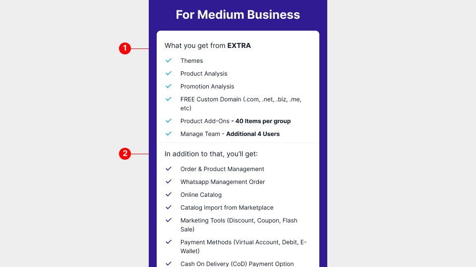
Scrolling further down showcases the paid additional features, above core features from the free tier. I collaborated with the UX writing team and sales team to refine copy. The marketing team would also be involved, to align on copy for promotional materials during launch.
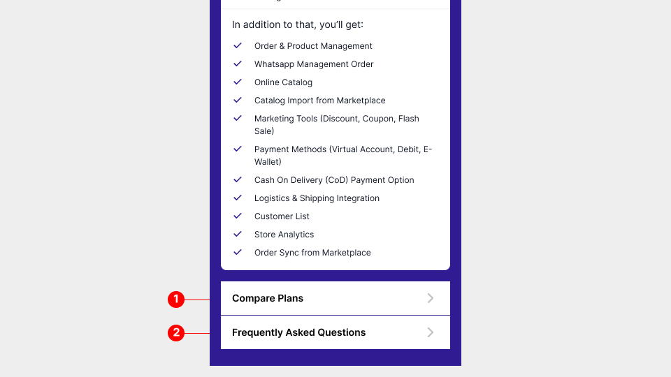
Closing off the screen in the footer section will be links to plan comparison and frequently asked questions.
Comparison Screen
The comparison screen effectively needed to allow users to understand the benefits of subscribing for a paid plan. Here I designed a simple table with clear sectioning and labels to allow side by side views of features.
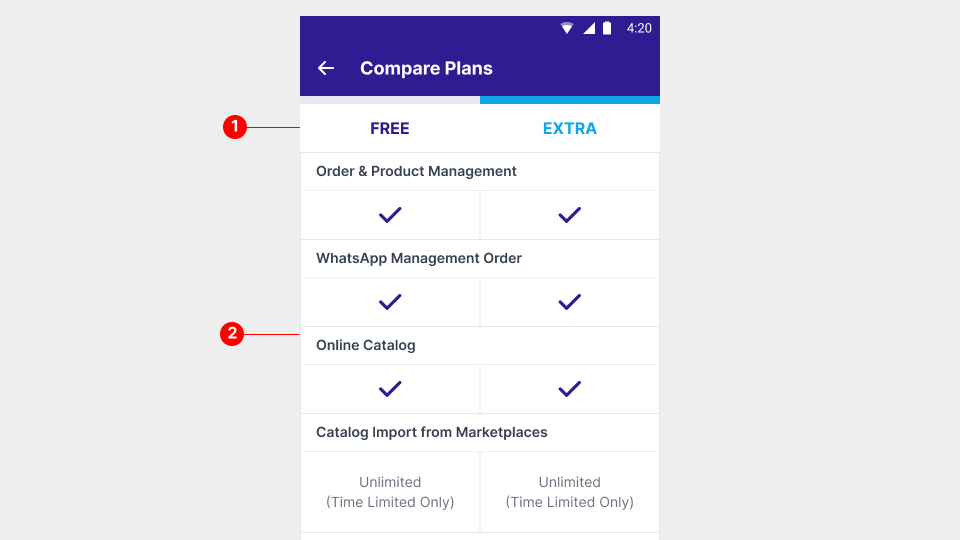
The usage of white-space and cell padding was to isolate content for easier reading and digestion. It was essential that users understood clearly and quickly how each tier stood out in terms of unique selling points.
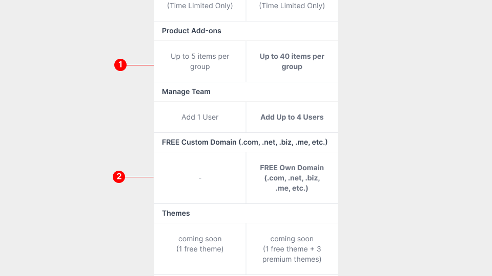
In the above example, benefits are bolded to drive emphasis and non existent features are represented with a single dash to reduce reading time. I worked with the UI team and the UX writers here to speed up perusal and time to value for users.
FAQ screen
The FAQ screen was another collaborative effort, now with UX writers and Customer support teams. It was important that we refrain from jargon and kept answers concise. Customer support team helped greatly with word choice maintaining consistency with messaging, especially since users contact support directly.
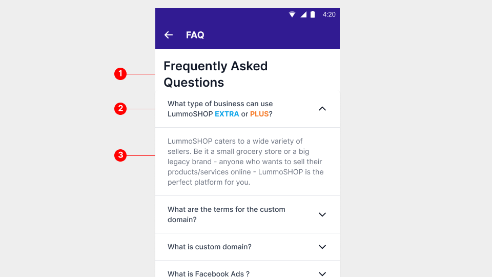
The design decision here was to implement an accordion styled toggle interface. Interacting with question tabs reveal their individual answers. This improved scanning and searching and greatly reduced scrolling and reading time. By default the first accordion toggle already revealed the first answer.
Conclusion
Overall, the multi-tiered subscription model, comprehensive go-to-market strategy, and crafting a meaningful user journey was well executed. We saw very favourable engagements, with analytics indicating substantial click throughs, with significant time spent on the plan comparison screens.
At it’s peak we saw over a 500 000 weekly visits to the subscription screen. In it’s first week alone, we saw a steady rise of conversions averaging 50 sign ups per day.
While this initial reaction from the user base were promising, a majority still felt the prices did not inspire subscribing to the plans. The monetisation had to regroup and rethink future steps before we introduce additional tiers.
