Building a responsive website for a physical sports store, highlighting exclusive items for sale, blogs and a social media feed

01. Design Brief
I was tasked to build an interactive mockup for the store’s online presence. The roadmap for delivery was within a 4-week timeframe. Outside of coding the front-end user experience, I collaborated with the creative team to establish a design system and produce various visual assets,
Demos
View the desktop prototype here
02. Discovery
Competitive analysis
I began exploring other existing sites at the time for benchmarks. Popular sites like footlocker provided excellent comparisons of what’s done well or could be done differently. Performing heuristic evaluation and contextual analysis also provided a foundation for initial development. I paid close attention to how product information was organised and presented. And how users would navigate the site’s menus and link structure.
03. Define
User Journeys
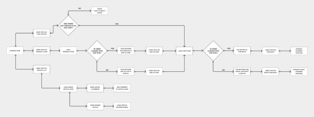
After that, I mapped out the user journeys. This helped in determining which essential systems and processes to prepare early. For the initial MVP, I focused on three critical flows:
- The purchasing flow for conversion
- Article reading/sharing flow for engagements
- And the user signup/login flow
Information Architecture
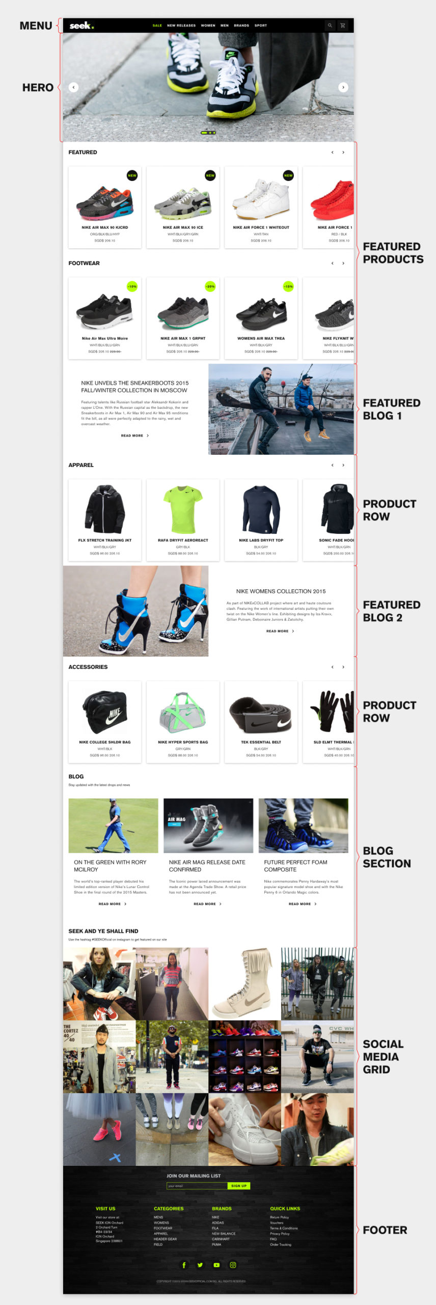
The landing page had three main sections, product, blog, and social media. The product section took the top position, putting items in front of customers. The blog and social media sections were tuned more towards engagement and sharing. In this early phase, the social media area will primarily be an Instagram feed promoting specific hashtags.
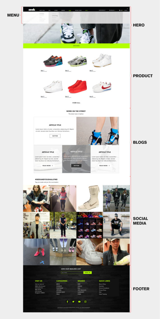
Reshuffling the stack
This initial sectioning of the site was sufficient for an MVP. However, stakeholders brought up issues that needed addressing. In particular, the blog section required more visibility. The reasoning was for partner brands to promote products with native advertising. I suggested breaking up the blog section and intersecting it with the product rows. This also provides monetisation opportunities by upselling article space with higher placement to partner brands.
Site Navigation
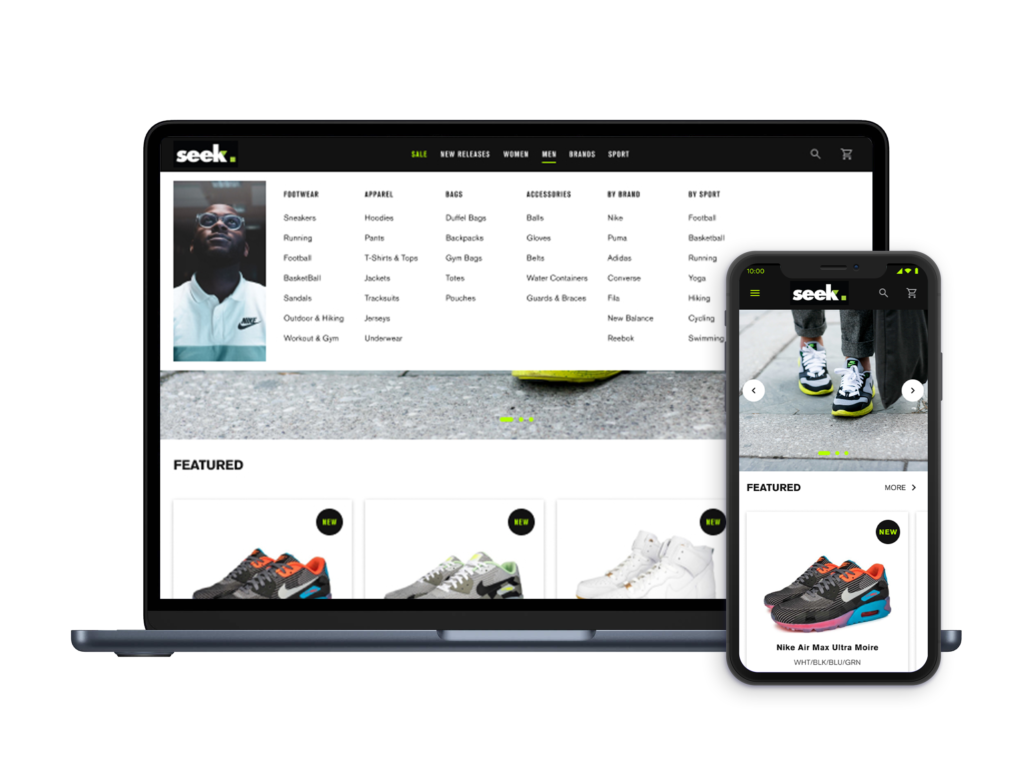
The initial desktop navigation had a hover-to-reveal dropdown system. While familiar and functional, hidden submenus didn’t show users all available choices. I saw an opportunity here to improve the user experience.
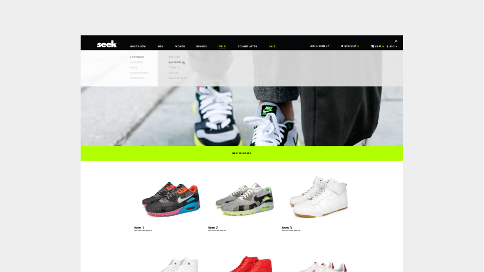
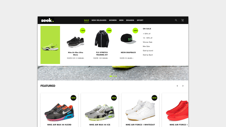
I suggested “mega menus” for the desktop version. Each main tab triggers a dropdown showing all relevant links, enabling users to make quicker decisions. I hypothesised that showing all options could improve product discovery and conversions. This was challenging because balancing the number of links with the limited space available was crucial.
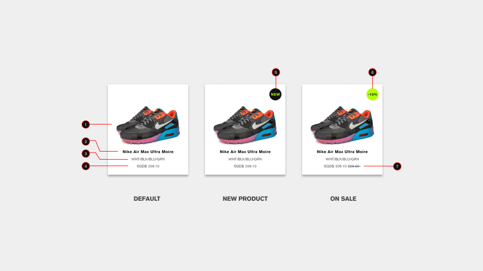
One plus point was the additional functionality in the example below. The sales tab dropdown could contain compact product cards. I conducted A/B tests with users to gather feedback on this navigation design. Some did mention being overwhelmed by the mega menus initially. But, the measured data showed increased clicks and actions than the hover and reveal style.
04. Design & Development
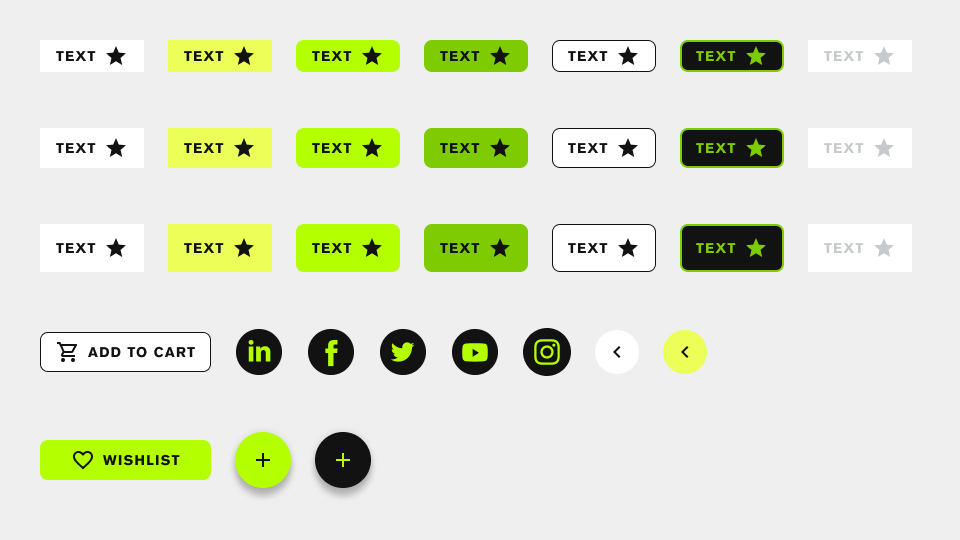
Design System
Fortunately, a branding guide was already established by the creative team. All I needed to do here was to translate that into a design system for consistency. With the system in place, I immediately started building a reusable component library. This included planning grids and breakpoints, responsive elements and screen-specific artefacts.
Once all the components were done, I proceeded development of the front-end experience. The project still underwent several iterations along the way.
04. Delivery
I had to present the completed mockup during a stakeholder presentation. The overall feedback was generally welcoming, with many positive comments on the clean and easy-to-use interfaces. Unfortunately, I could not get feedback from actual test users for initial reactions.