Design Brief
This was a team project during my training at General Assembly Singapore’s User Experience Design Immersive. The project duration was two weeks, with an interactive prototype and research documentation as deliverables. My contribution was assisting with the UX research, restructuring the information architecture, and UI design. My primary task was to deliver the final prototype for presentation.
Demos
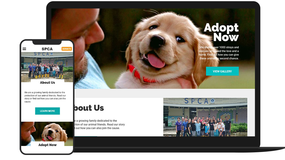
View the mobile prototype here
View the tablet prototype here
View the desktop prototype here
Initial Discovery and Takeaways
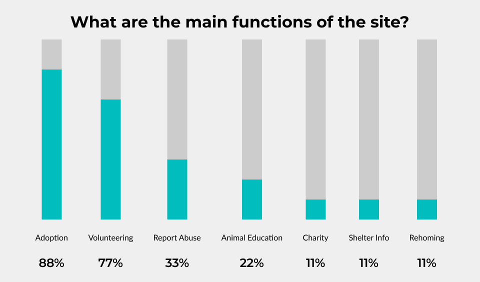
Our first step was conducting UX interviews to see how users would respond to the website’s current state. We recruited nine users between 22 and 35 years old and asked them to express their thoughts on the site’s primary functions. We got the following results:
- Adoption (88% of users)
- Volunteering (77% of users)
- Reporting Animal Abuse (33% of users)
Next, we got the users to perform these functions and to “speak out loud” as they do. From this, we derived the following paint points.
- The site was not responsive, and users who performed the tasks on phones struggled the most.
- The information for several pages was too wordy and needed to be more concise and focused.
- The adoption gallery panels for each pet didn’t provide enough details about the animal’s condition or needs.
- The abuse reporting wasn’t clear about what the necessary steps were and needed a way to report any abuse with immediacy.
- The phone number to report any incident of abuse needed to be more prominent.
- The volunteer/career page needed more streamlined instructions and a more organized way of displaying openings.
Feature Prioritization
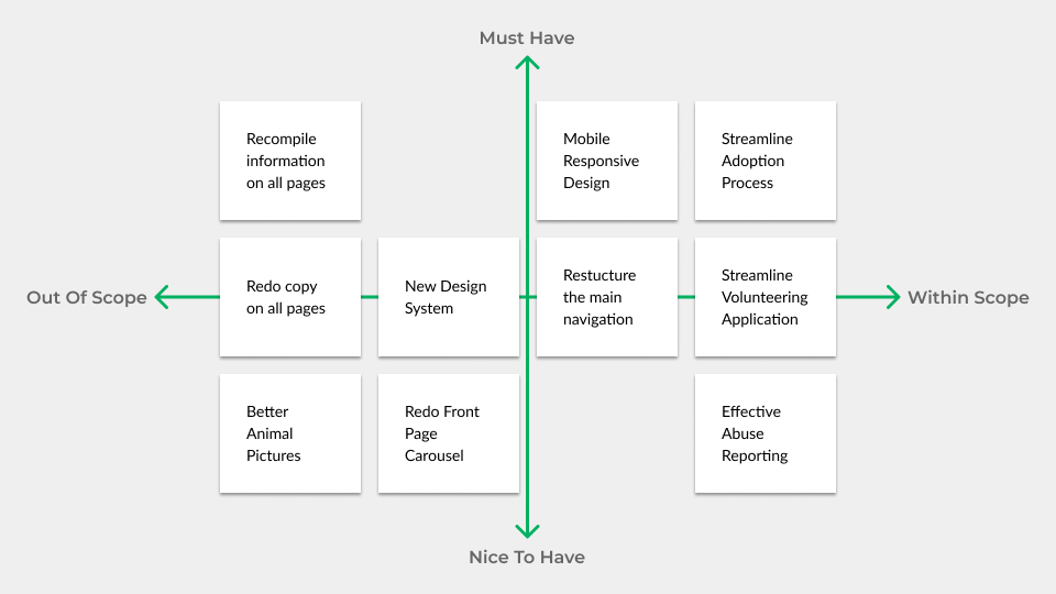
With the project limited to two weeks, the following key features were prioritised.
- Responsive design with a mobile-first mentality.
- Overhaul the main navigation for users to access core tasks.
- Streamlining the adoption process
- Streamlining the volunteering process
- Enabling users to report abuse more effectively.
Information Architecture
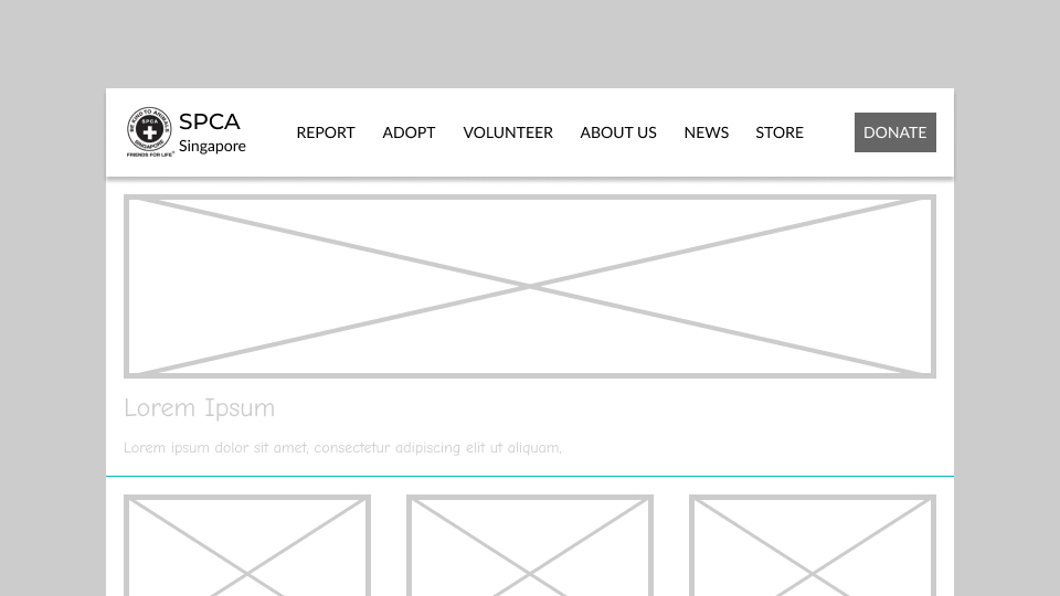
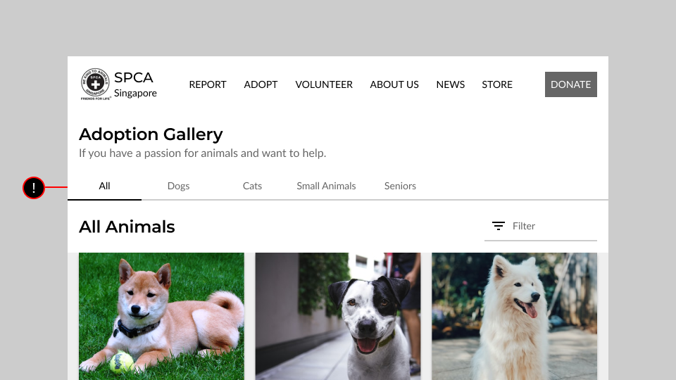
The first step was redoing how information was presented and organised. A common complaint was difficulty accessing entry points. For example, the adoption gallery is hidden two levels beneath the “Our Services” tab on the screen below. Users also mentioned the naming of links here didn’t correspond to what they were expecting.

Besides that, many pages had no clear calls to action. For instance, while this adoption screen displayed the available animals, users could not select a future pet to initiate the adoption process.
Reorganising the Main Navigation
Instead of multiple links with nested sub-menus, I reduced the main navigation to six core links. These included all three primary functions determined from user interviews. I also added about us, news and store links. I intentionally made the copy simple to reduce the guesswork for users.
For the mobile version, the main navigation will be hidden off-canvas. A menu button in the header will toggle the reveal of the navigation.
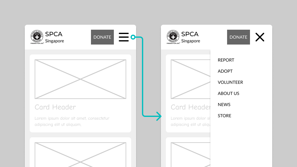
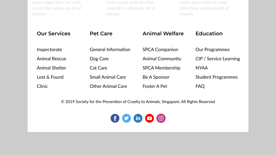
The remaining links from the main navigation will then be relegated to the footer area. While not the most elegant solution, these links are technically still accessible on all pages. Keeping in mind the time given, this was my best solution.
Streamlining the Adoption Process
My first step in overhauling the adoption page was performing a content audit. I started identifying core components and labelling them.
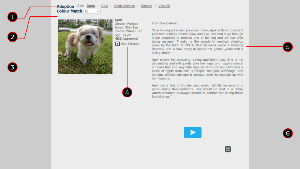
- Sorter ( refreshes content based on animal category)
- Colour Match ( reloads data based on “colour”, which means animal temperament)
- Animal Photo
- Animal Details
- Name
- Gender
- Breed
- Colour ( here, it means actual physical colour)
- Age
- HDB Approval status
- Link to more images ( loads a js lightbox style gallery with scrim)
- Note from Fosterer
- Accompanying Adoption video embed
Next was to create cards, only retaining the essential information. This excluded items such as fosterer notes and gallery links. These will appear later on individual animal pages, which can be accessed by a “Learn More” CTA at the bottom of each card.
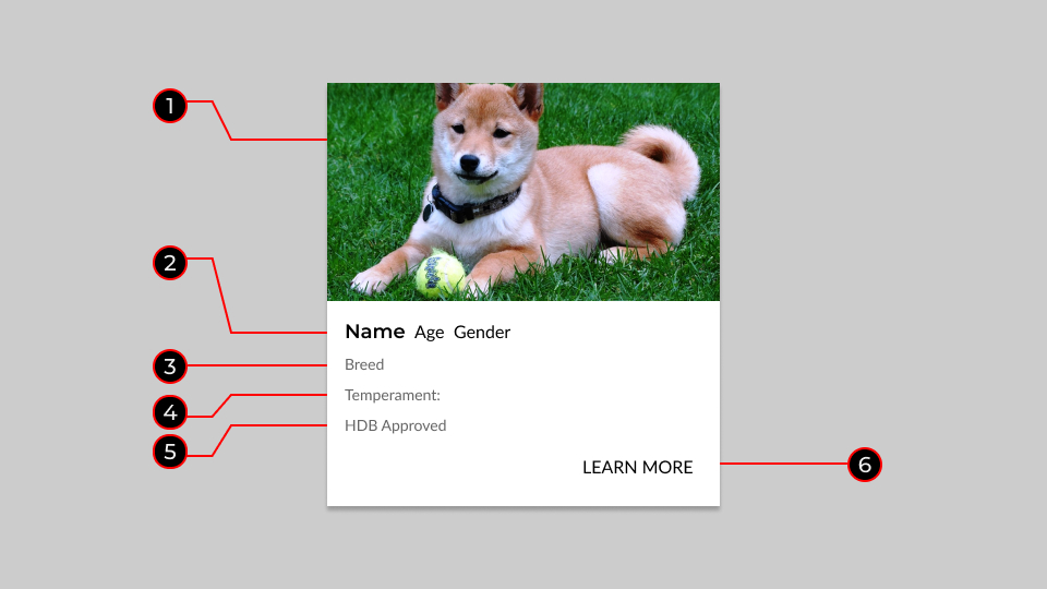
- Animal Photo
- Animal Name / Age / Gender
- Breed
- Temperament
- HDB Approval Status ( Only for Dogs )
- CTA link to a single profile/adoption page
Cards were then aligned into grids for various devices. This is to reduce vertical scrolling on larger devices and allow a better comparison view.
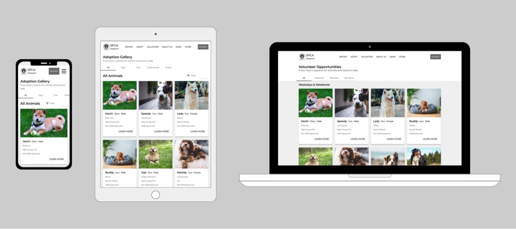
Animal cards can then be filtered with tabs—the first tab defaults to all available animals for adoption. Subsequent tabs will follow existing categories set by the SPCA.
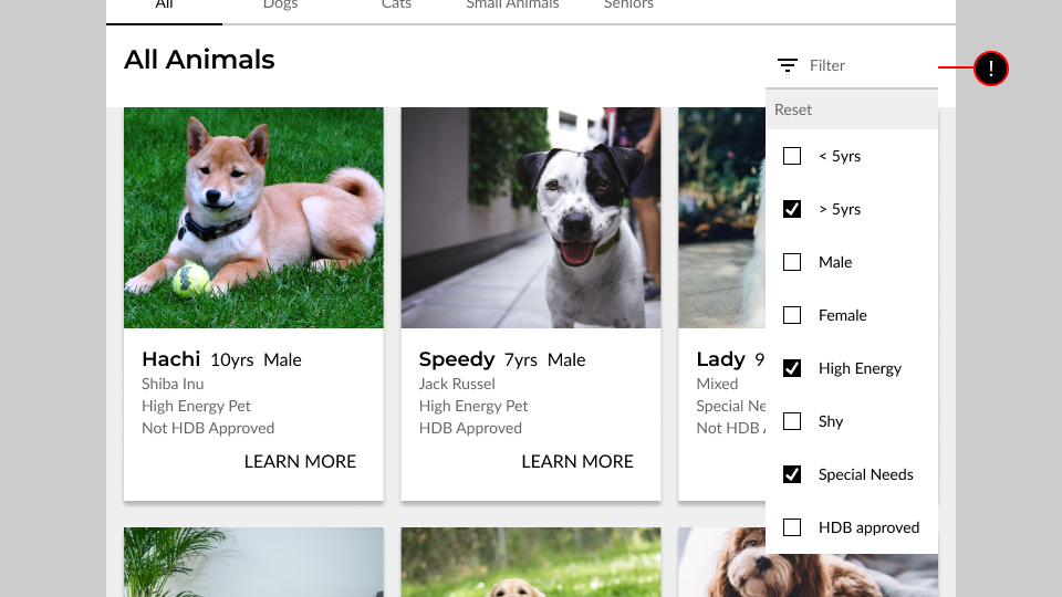
Adding more options
Creating another level of selectability was a filter button. This revealed a dropdown of additional options for users to refine their search.
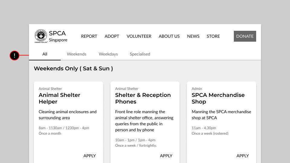
Streamlining the volunteering process
The volunteering page would follow a similar framework to the new streamlined adoption process. This means developing a similar card system for volunteer postings.
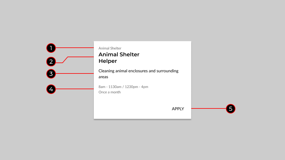
- Volunteer Category
- Volunteer Role
- Role Description
- Shift and Frequency
- CTA link to the application page
These cards will use the same grid system and have a tabbed sorter. Tabs will sort according to availability for weekends, weekdays, all week and specialised roles.
Report Abuse Effectively
Though the emergency hotline was displayed in the main header, users easily overlooked it when tasked to report abuse. Some found the contact page below and eventually located the form link and call instructions after scanning. However, most expressed that the entire abuse reporting process lacked urgency.
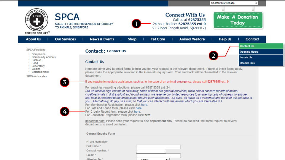
- Emergency Contact in the main header
- The entry point to the contact page in Main Navigation
- Instruction to call the hotline in case of an animal emergency
- link to form to report animal abuse in a non-emergency
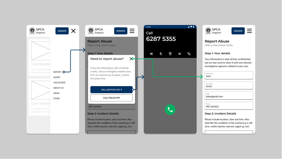
Addressing Urgency
Based on users expressing difficulty when reporting abuse during an emergency. I created a specific use case for phones. The site would trigger a call modal if viewed on a mobile device. The CTAs in the modal could then initiate a phone call. The modal could also be closed, and users could report as usual with the form.
Deliverables and Outcomes
The testing group met the website redesign positively, with many stating that the site now seems more streamlined. The major takeaway was how the downsized navigation and information hierarchy now is clear and easier to click through.
Reflection
While the shop, about us and news pages were added to the main navigation, issues with these pages were not addressed. Streamlining these pages on the site just wasn’t possible within the deadline. Mainly with their information overload and incoherent navigation. If we had been given more time, these pages would have also been reworked. The lesson learnt here was only to fulfil key feature requests and stay within scope. It was tempting to solve all the problems simultaneously. But the consequence could be losing focus on what users needed most.